Who has been hiring and hasn’t?
After the start of the worst six months for the U.S. labor market since the Great Depression five years ago, we learned last week that 203,000 new jobs were created in November and the unemployment rate dropped to 7%. Discussion in the immediate aftermath of the news centered on whether the report marked more of the ho-hum same or a sign that, after three years of puttering along, the economy might finally be preparing for a return to something approaching prosperity.
We won’t know who’s right about that for months, maybe even years. So let’s look back instead. First, briefly, back to November 2008. U.S. employers had been shedding jobs for a few months already, but in November it turned into a mass defenestration: 775,000 jobs lost. And it went on like that for five more months. March 2009 was the worst, at 830,000 jobs lost. (These numbers, as with all those that I’ll cite here, are adjusted to iron out seasonal factors such as the customary rise in retail employment before Christmas and bust soon after.) The total for the six-month period: 4.5 million jobs lost. For the entire two-year-long contraction: 8.6 million. And we still haven’t gotten those jobs back. At 136.8 million jobs in November, civilian nonfarm employment in the U.S. is almost 1.3 million below its January 2008 all-time peak.
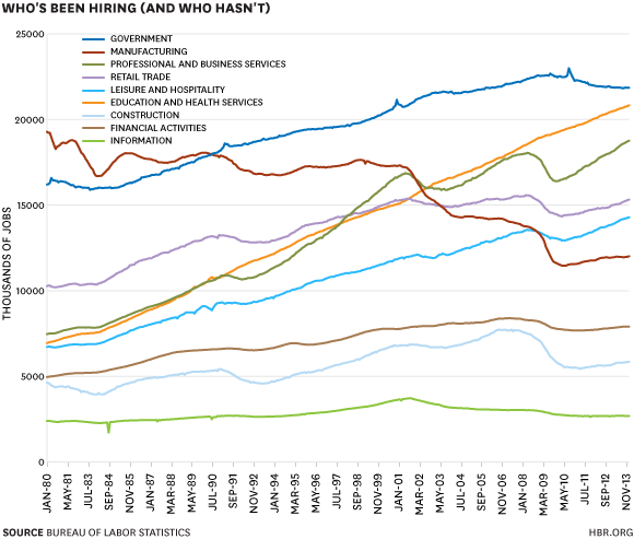
That’s not true of every industry, though. A few kept setting new employment highs even during the recession; others have kept declining even during the recovery. Cyclical fluctuations have a big impact on employment, and the worst recession in 75 years has an especially big impact. But over time it still pales next to secular shifts in the economy. And secular shifts make for cool charts! To start, here’s how things have gone for the main broad job categories (and three smaller ones of interest: finance, construction, and information) since 1980:
The most remarkable line in the chart is education and health services, which just keeps rising and rising, paying no mind whatsoever to the rest of the economy. This is mostly about health care, which accounts for 70% of the jobs in the category and has been adding them much faster than the educational sector. It’s also an understatement, as employment at public schools and government-owned hospitals shows up in the government category.
The government employment line is interesting, too. The number of government jobs peaked in April 2009 at almost 22.7 million, and while it seems to have stopped declining in the past few months, it isn’t really rising, either. This has been mostly a phenomenon of local governments, which account for 64% of government employment in the U.S. and were hit hardest by the decline in tax revenue in the aftermath of the housing crash and recession. Federal government employment, if you don’t count the once-in-a-decade binges of Census hiring (the funny little spikes in the government line), actually peaked back in the late 1980s. To repeat, the U.S. government has fewer employees now than it did in 1989. This doesn’t count non-civilians such as soldiers, CIA agents, and NSA snoops, but there’s no way that even big increases in employment at the latter two would make up for the 500,000+ decline in active-duty military personnel since 1990.
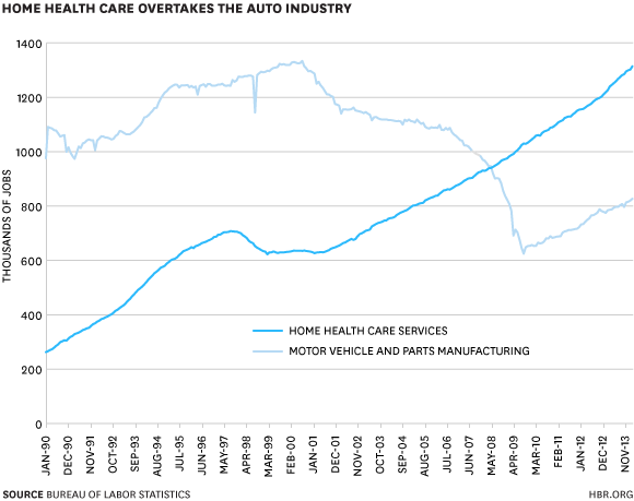
Beyond that, the chart mainly shows the already flogged-to-death contrast between rising service industries and declining manufacturing. Yes, manufacturing employment has been rebounding since bottoming out in 2009, but it’s from an awfully low base. For a more dramatic version of this, here’s the once economy-dominating auto industry plotted against an especially fast-rising category: home health care services:
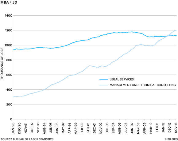
The average hourly wage in the home-health-care sector, in case you were wondering, is $18.90. Among motor vehicle and parts workers it’s $24.06. That’s actually not as big a gap as I expected, but it does fit the oft-decried model of better-paid fields losing ground to worse-paid ones. Still, not every tale of changing fortunes in the workplace has such a discouraging ending. The average hourly wage in management and technical consulting is $37.44; in legal services it’s $37.07. And look who’s winning that jobs race:
As for the headline, yeah, yeah: most of the people in “management and technical consulting” jobs probably don’t have MBAs. But the chart does pretty dramatically illustrate the tough times the legal profession has been going through for the past decade. And while Clay Christensen, Dina Wang, and Derek van Bever say the consultants are next, it’s not showing up so far in the jobs numbers.
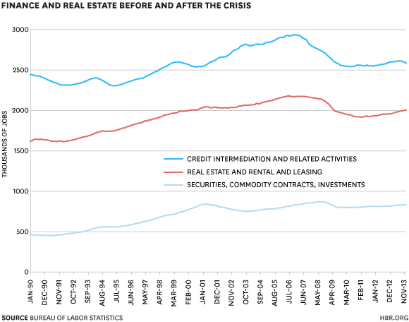
One sector that was booming up until the crisis and then tanked spectacularly was of course the financial-real-estate complex. One thing that’s a little surprising to see, in the first chart of this post, is that finance isn’t one of the really big job categories. True, there’s a bunch of real-estate-related jobs outside the category (construction, home-improvement retailers), but for all its impact finance itself just isn’t that big an employer. As for what’s been happening within the sector, credit intermediation (banks and other lenders) took a really big hit and seems to have started shedding jobs again, real estate has held up a bit better, and “securities, commodity contracts, investments” (Wall Street, more or less) has held up best of all. The dot-com bust appears to have hit it harder than a global financial crisis did:
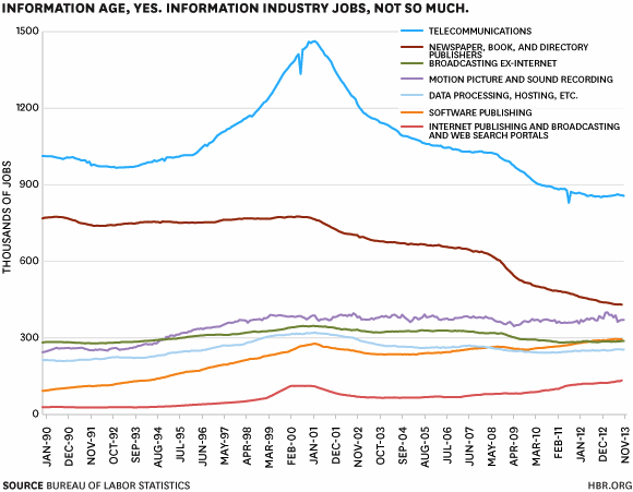
The average hourly wage in that last sector is $48.82, by the way. Which is a lot higher than the $27.49 hourly wage at newspaper, book, and directory publishers (which includes magazines). We all know it hasn’t been going well for old media, as my final chart clearly shows. What’s interesting, though, is that information industries in general haven’t really been contributing to job growth. The growth in software and Internet publishing is nice, but they just don’t account for all that much employment, yet:
Photo credit: Jacksonville Business Journal


